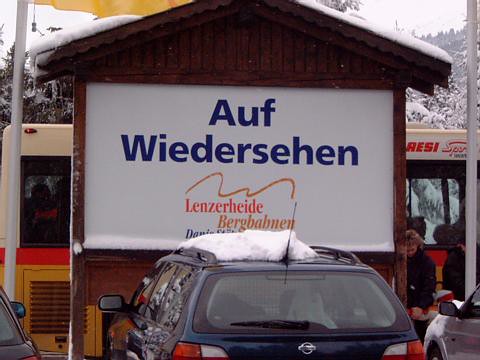
 When you think of something that's Swiss, you probably think of the Cuckoo clock, Swiss chocolates and Swiss watches. But another popular and wide spread invention of the Swiss is the Helvetica font, which you are reading right now. It's certainly not something I think of when I think of a popular Swiss invention.
Over the years the font has evolved from the original Swiss Helvetica, to Helvetica New, and Helvetica new light as well as bold versions of these fonts. If you'd like to see a few examples, just check out the street signs in Zurich or on a Microsoft Word document.
Switzerland created the Helvetica font 50 years ago. To mark the anniversary, American filmmaker Gary Hustwit has produced a documentary devoted to the iconic font. The documentary, also entitled Helvetica, includes interviews with designers and the son of the man who created the font.
Helvetica, considered an icon in the 1960s and 1970s, has shaped the urban landscape like no other typeset before. The popular font can be found all over cities from Zurich to Milan, London, Berlin to Tokyo and New York. It can be seen wherever you look, on advertising boards, menus, and street or train signs. I bet it's not something you notice every day!
In the 1970s, even such companies as Migros and the Swiss Federal Railways adopted the Helvetica font to boost their corporate identity. When the Helvetica design was first created, it was a font used solely by printers and designers. Today, millions around the world use it.
Helvetica is so popular in Switzerland, especially in Zurich, where you can see it everywhere including train stations to trams and buses, road and shop signs.
Now my challenge to you is to go out there and snap a photo of the Helvetica font!


No comments:
Post a Comment